Redesigning the Cisco Webex Mobile App — a UX Case Study

Project Overview
Cisco Webex Meeting is a video conference app to allow users to easily join online meetings from everywhere, on any device with high-quality video. This app also provides some features such as Multi-streaming, Numeric Meeting Password, and Customizable Video Address. With all those benefits, my college tried to maximize the function of this app by held some seminars to teach students with the Webex Meeting for all the lecturers. During the event, I realize that some of the lecturers have some trouble when they use this app because some of the steps make them confuse. So I decided to redesign this app with my design concept.
Goals
Make it easier for the user to have an online meeting, giving the user the right information about what they need to do, also provide an interesting experience when using the app.
Tools
- Figma
- Adobe Photoshop
- Miro
Design Process
In this redesign, I used a design thinking framework for making appropriate products. Design thinking consists of several stages, such as empathize, define, ideate, prototype, and test.

1. Empathize
Observe
I’m doing observation of all the participants in the event which is held by my college. This event ran for one week on Monday, Wednesday, and Friday. Each session has different participants from every department, makes me realize there is always some participant that can’t follow the pace from the instructor, so they are just watching the presentation instead of following the instruction. Besides that, another participant always needs more explanation about the flow of the app, which I thought the instruction to operate the app is very clear.

Discovering Through Research
Using the human-centered approach, therefore I try to build empathy with other users which is the student who also used the app.
Interview
To gain more insight, I need to know the pain points from another user that acts as a student that receives the information. So I tried to conduct a 30 minutes interview with some students about their experience when using this app remotely.
They don’t think the app is fit for them because they see this app as a business app rather than a daily app
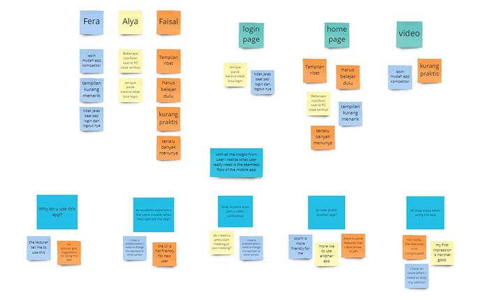
From the interview, I try to assess my understanding of the scope to identify each of the statements by adding several questions after the user giving a statement.
Review
In addition to conducting research directly to users, I also research by looking at other users’ reviews in the review section to get more insight. This is a capture of some Webex Meeting App reviews.

Competitive Analysis
Before entering the next design phase, I try to compare the features from a similar app. I found 2 products for my research, i.e. there is a Zoom and Google Meet. All of these companies provide video conference features.

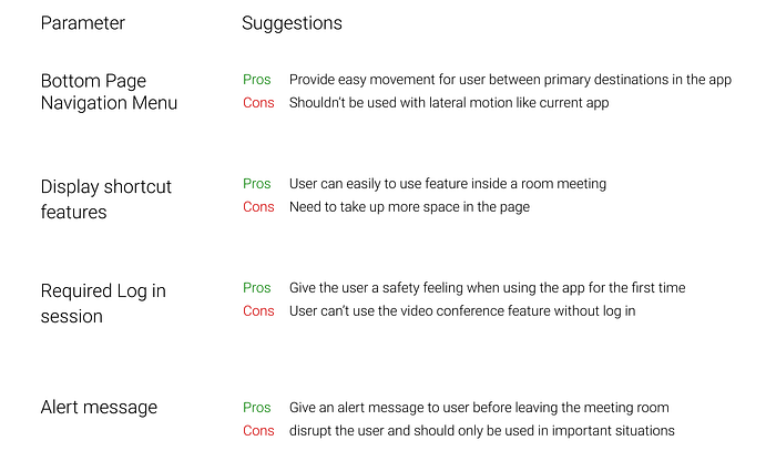
As you can see in the photo above, Webex has the same advantage as the other app, but why users more likely to use another app? to gain more insight I tried to analyze some existing features on similar the app.

2. Define
After getting all the data from the interview, I’m trying to compare the pain points from students with the pain points from all the participants. The purpose is to find the connection between all the data, and doing this activity helped me sort through all the comments to get a clear view of what was important to users.

Job Stories
I used a framework to create job statements based on user interviews and reviews to understand their motivations, situations, and outcomes in using a video conference mobile app.

Screen Problems
In the previous phase, I explored what existed and where there was room for further exploration, this is the problem that I discover.

Pain Point
This is a problem faced by the user:
- Need to join a meeting immediately
- Can’t find some certain features in the app
- Don’t know how to use features properly
3. Ideate
From the results of the previous phase, I realize a competitor application is easier to use because some of them do not have many features like Webex. So I’m trying to make it more simple for users to operate the app, provide the features that users need instead of displaying all the features option.
“Design is so simple, that’s why it’s complicated” -Paul Rand
At this stage, I do several things:
Sitemap
Create a journey map to understand the flow when the user wants to start a meeting or join a meeting start from the login page.

User Flow
I created a proposed user flow to help find what the user is looking for. We are indirectly assigned to fulfill their expectations.

4. Prototype
Wireframe
In this phase, I made some wireframes based on the ideas phase to help me to see what’s product looks like. Here are the final results.

First UI Exploration
The first interface that I made is based on the wireframes, and then I try to test the screen to the user. All of the users said that they liked the screen, but the way they said it makes me feels something is not right.

I try to ask them again, and then I realize there is too much unclear spacing on this screen, the home page is not giving a good first-impression enough, and the room meeting can be more improved.
Second UI Exploration
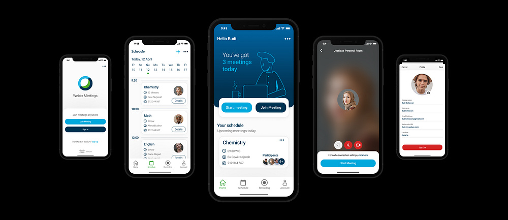
I decided to changes the looks on the homepage to make it more giving the user the information they need, below is the second iteration that I made based on the feedback I received.

I changed the homepage looks by added some illustration to display the upcoming meetings for the user based on the schedule. Before that, it was just showing some buttons to start or join a meeting. I also moved the button a little bit up but it still accessible in terms of thumb reach.

In the schedule screen, I changed the way it looks by adding some spaces, and the purpose is to help users dividing attention for every section on this page.

Next, in the meeting room screens, I changed the position of some button to group them into a different section. Rather than before, the meeting button is at the same level as the microphone and video button, and the purpose is to put all the configuration features into one group that the user goes to see first before starting the meeting session.

I also add the chat button in the meeting room after checked out other competitors that provide these features on their screen and confirm this decision by received feedback from participants. This purpose is to make the chat feature more accessible for the first-time user.
Created the Prototype
After some wireframes and high-fidelity, I created a task prototype to simulate how to create a meeting schedule that starts from the home page to the meeting details with Figma.

5. Test
After creating the prototype, I tested my solutions using the usability test task/questions from my initial tests. To see how the user can perform a given task without significant difficulty, I conducted usability tests with some tasks that they need to do.
- Start a meeting
- Sign in and join a meeting
- Sign out from the app

From the result, all the participants successfully did the task, but having some minor troubles when they need to add a meeting schedule. When the user wants to add a meeting schedule they frequently tap on the options button instead of the add button.

The design that I proposed giving an enjoyable experience for the user in using this app, but there is still some part that needs to be validated again with the different user to gain more insight
Conclusion
Cisco Webex mobile app is an amazing product with all the features that this app provides. This app is really powerful for the user that needs video conference features with high-security access.
I think this concept still lacks some research and needed more iteration before it can actually solve the problems. There are so many spaces that can be improved with some unexpected scenarios that can happen in this case.
What I learn
I am glad I took the chance to received feedback from participants before moving forward to the next design phase. This iteration process makes me realize how important is to understand user behavior when using the app.
Disclaimer: The purpose of this case study is to learn how to redesign an app & improve my skills.
